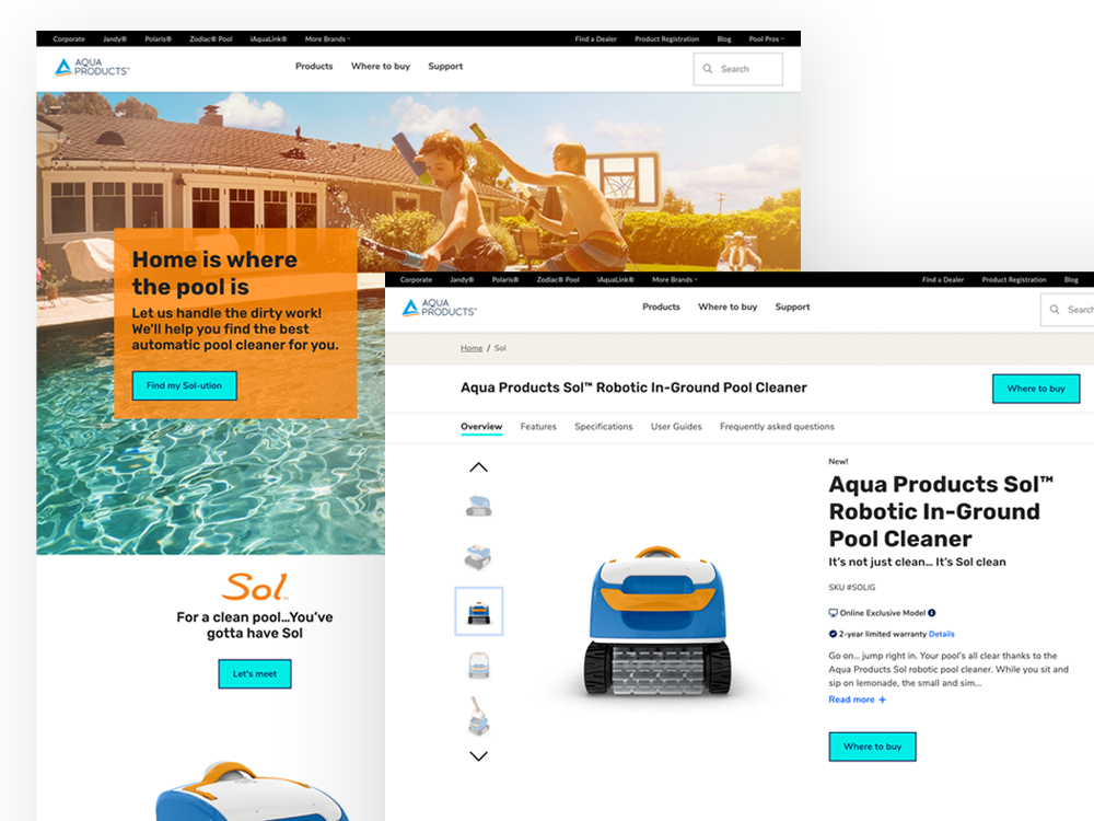
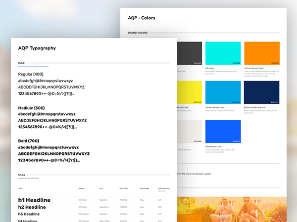
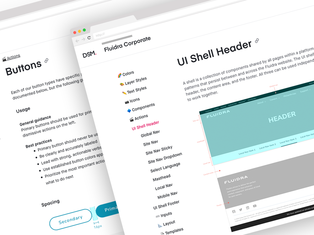
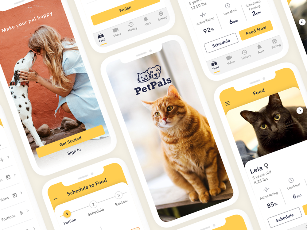
My job as a UX designer is matching technology to the way people think. I unite products and users, design and experiences.
I'm a problem solver for design issues. I design clean and consistent UI while making sure not to sacrifice functionality just to achieve an aesthetic.
Communication is a core part of my research. I carefully listen and observe users to understand their needs, frustrations, and motivations.
UI/UX Designer | NN/g UX Certified
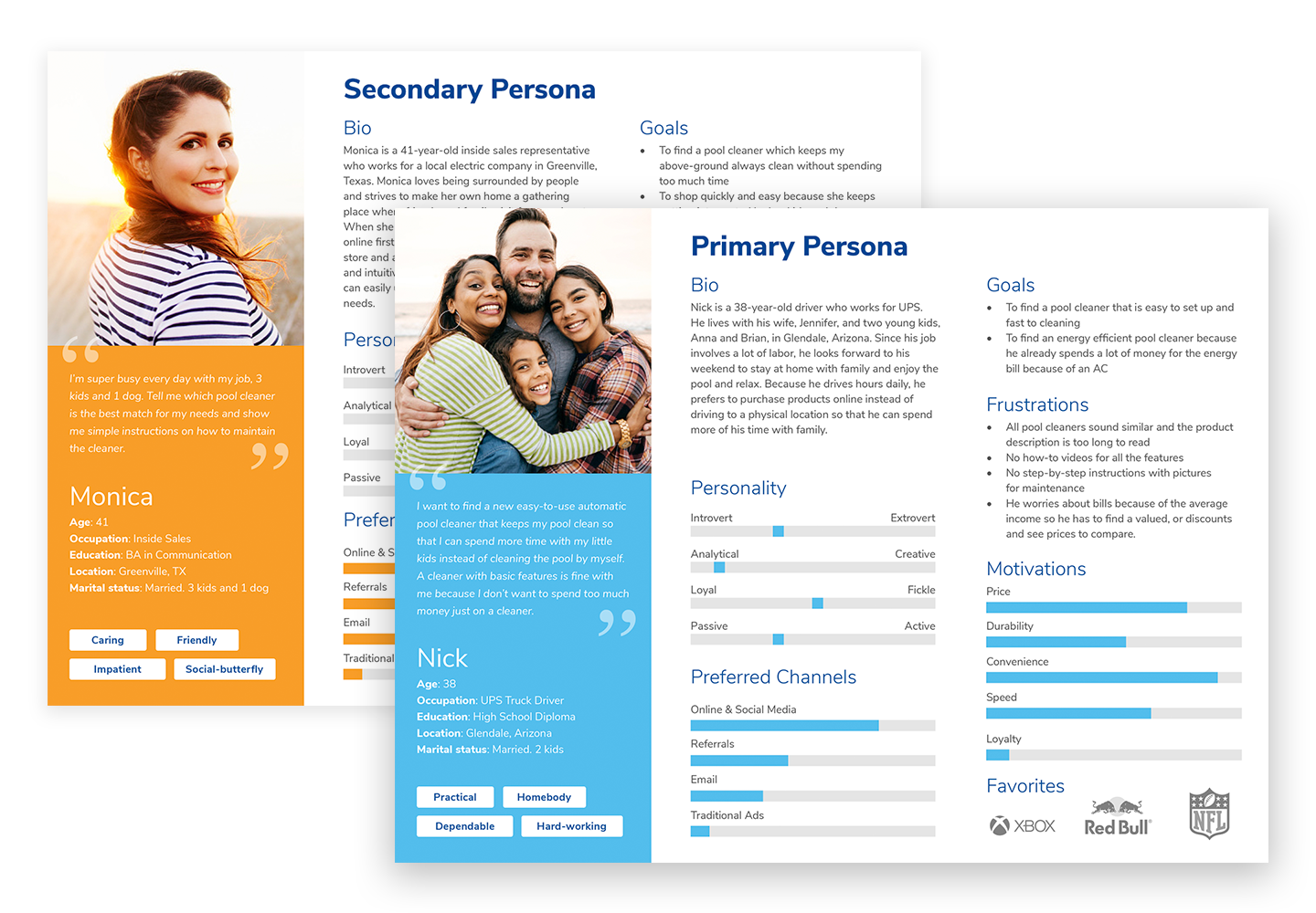
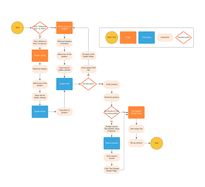
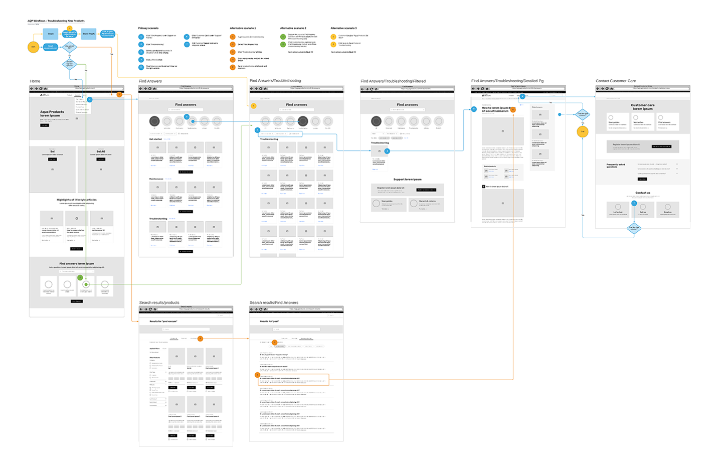
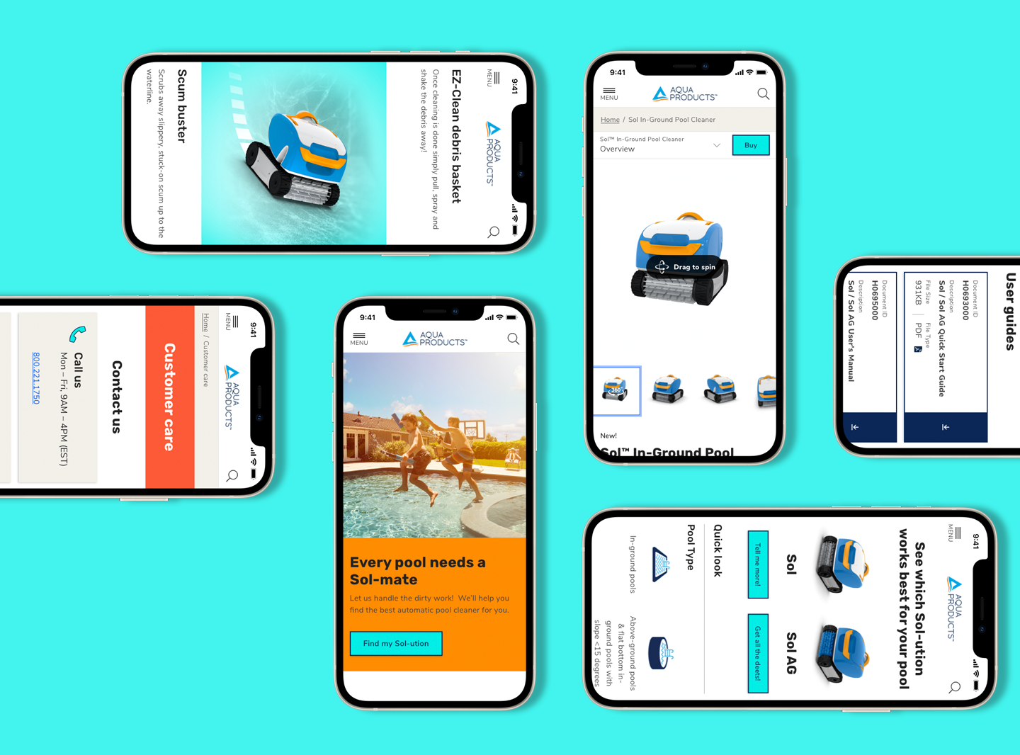
I research, design, and deliver user-centered products. Communication is a core part of my craft. I carefully listen and observe stakeholders and users to understand their needs, frustrations, and motivations. I’m equally focused on building a good relationship with team members because, as a team, we can design and deliver better products together that solve complicated issues and delight users.
When I'm not designing, I'm homebrewing, roasting coffee beans, or visiting craft breweries. I'm also a certified beer judge by BJCP (Beer Judge Certification Program).
Providing users easy-product comparisons and an effortless shopping experience.
Aqua Products is the swimming pool cleaner brand that provides simple, easy-to-use cleaners at affordable pricing.
Aqua Products is an online-sales-only pool cleaner brand, but its own website doesn't directly sell products to consumers. The previous website only provided the partial shopping experience—product information, rebate form, customer support, and authorized dealer lists. Users needed to visit one of the authorized dealers' websites and look for the same product again to purchase. Plus, the Aqua Products website was not intuitive to find information that users were looking for even though it had useful information.
The main goal was to make product search and comparisons easier and to connect the shopping path between the Aqua Products and authorized dealers' websites to provide users with an effortless shopping experience.
Another goal was to make product maintenance and troubleshooting information intuitive and easier to understand.
The first step was interviewing stakeholders. Their valuable insights guided the flow of the project, such as business goals, technical constraints, and usability issues. Next, I conducted user interviews and surveys to discover the issues on the current website. I also reviewed usability testing results with the existing site to understand how users interact and where they struggle as they navigate.
I additionally conducted the following research activities:
These analyses helped us plan the new website strategically, narrow down who the target users are, where users struggle and what to focus on improving.
Based on the interviews and analysis, I found patterns in users' perceptions and tasks and aggregated my findings in the form of a persona.
I collaborated with team members to develop an onboarding customer journey map to identify touchpoint opportunities as users go through our product and service offerings. By learning their journey and experience, I discovered pain points and improvement opportunities below:
The research led us to the following recommendations we presented to the stakeholders.
In this phase, I created a site map to showcase a clear overview of the page structure and information architecture. Also, I created user flows to visualize the path a user takes to complete the tasks.
After having multiple team reviews and revisions, I developed wireframes. We especially spent time improving the Knowledge Base because we received feedback from multiple users that they had difficulty finding the maintenance instruction or troubleshooting information.
I created wireflows to review interactions one more time. Building wireflows helped the team see the path visually.
I created multiple designs to experiment and explore various approaches. We incorporated user feedback and ensured that our final design is valuable both from a business and user standpoint.
The previous website had a large amount of product information. However, it didn't specify how those product features and technologies would benefit users from a user-centered perspective. We changed the brand language to focus on user-benefits and explained how the products solve issues and improve users' pool cleaning experience.
We successfully launched the first phase of the website but the project continues. The following feature will be implemented and re-tested:
Develop consistent UI components and design libraries to speed up and increase the efficiency of the design and development processes while delivering quality user experiences across a broad platform.
Aqua Products is the advanced swimming pool cleaner brand that provides simple, easy-to-use pool cleaners at affordable pricing.
This project's main goal was to establish a new design system within 8 weeks from start to finish that promotes simplicity, quality, and new brand identity in design. To achieve this, we needed to build the guidelines and UI component library to share between designers and developers to speed up the design process.
The second goal was to ensure the design system meets Web Content Accessibility Guidelines (WCAG 2.1) to deliver a seamless user experience and company message to all users, regardless of their ability.
Research best practices and establish guidelines and rules of interaction and visual designs. Build a UI component library in DSM (Design System Manager).
Before jumping into research and design exploration, we audited existing components in our existing products and design systems. Since we are building a universal design system at the same time, we needed to research the best practices that apply to universal purposes across all brands. This process was crucial because this project required a fast turnaround within a short time frame so that our small team wouldn't waste any time.
Next, we made a timeline based on what we needed to complete and when we needed to complete it. This step helped keep the team members involved in the design system updated on progress and facilitated resource allocation.
With limited time besides other responsibilities, we strove to have multiple weekly design system discussions. The UX designers and the project manager were often swamped with work and unable to meet but we kept our discussions going on Slack to ensure we all agreed with the proposed ideas and direction.
We documented our discussions on Google Drive in order to keep track of decisions as well as how we reached these decisions. This was really helpful at times when we had to revisit components that were discussed previously. We often refer back to notes such as this to better facilitate subsequent decisions.
One of the biggest challenges was the disagreement on the color decisions. The brand team provided the combinations of very bright colors that reflect the fun, exciting brand identity, but 80% of the suggested color combinations didn't meet the accessibility standard. We had multiple discussions with the brand team and explained the importance of meeting accessibility, but we couldn't come to an agreement. Additionally, the company executives had already approved all the brand colors so we were not allowed to modify them.
To get everyone on the same page without sacrificing accessibility, we visualized all the color combinations that worked and didn't work. This extra step helped us agree on the new color combinations and move onto the UI design.
After defining the required components, we created UI libraries and patterns in Sketch for all states and scenarios. The UX designers, the developers and the PM reviewed and made necessary modifications.
Once we all signed off on the designs and patterns, I uploaded the UI component libraries and guidelines to DSM (InVision Design System Manager) to share with the other designer to implement them across the product to build high-fidelity prototypes. Since we are also building a universal design system, we kept the documentation in this Aqua Product design system as simple as possible.
Developers could also inspect a design and link their codebase and documentation sources to these components on DSM.
We successfully launched a website (phase 1) based on the new design system. The design system is still a work in progress but we achieved the key tasks below:
Building and maintaining a design system is a never-ending task as we continue to update and adapt it to better suit our business and user needs. It's not a simple task, but it's achievable because our small but excellent team always collaborates and supports each other. Thank you, team!
Build a design system that promotes consistency and clarity and speeds up the design process.
Fluidra is a global swimming pool and wellness equipment company.
When I joined the company in 2019, I had to face many challenging opportunities to expand my knowledge and skills. The company didn’t have any well-established design systems. There was only a basic style guide that was originally created for print projects and was not well-adapted to digital design. The existing website, based on this style guide, was not built following the tenets of user-centered design and didn’t meet accessibility standards.
My challenge was to establish a new design system that promotes consistency, clarity and quality in digital design and building the guidelines and UI component library to share between designers and developers to speed up the design process.
Another challenge was to improve accessibility and ensure that the design system meets Web Content Accessibility Guidelines (WCAG 2.1) to deliver a seamless user experience and company message to all users, regardless of their ability.
Research best practices and establish guidelines and rules of interaction and visual designs. Build a UI component library in DSM (Design System Manager).
A design system is far more than a style guide or pattern library. A design system is a continuously evolving single source of truth that establishes guidelines of interaction, visual narration, principles and code.
I first researched successful design systems, numerous UX studies on various components and various design patterns to understand why they worked or didn't work well for users. This step was critical for our small design team because we had limited time and budget to conduct our own UX studies.
Then I built the UX strategy documents which incorporated benchmarked interaction of each component, best practices and guidelines so that the product team and stakeholders can easily access, review them, and add feedback. After days of exploration, research and revisions, we arrived at a strategy and set of guidelines we were all happy with.
The next task was to create an extensive suite of UI components and patterns in Sketch for all states and scenarios for our team to use. Sketch is a great UI design tool for product design.
Another great tool we used for building the design system is InVision DSM. DSM is a powerful tool for creating and maintaining a design system between designers and developers.
I uploaded the UI components that I created with Sketch to DSM to built UI foundations and component libraries. I also moved all the UX strategy documentation from Google Drive to DSM and passed the system to the developers to complete the design system.
The new design system brings significant benefits for a product team and, most importantly, the users. I learned the importance of being mindful when creating the design system because I won’t be the only designer or developer who works with it. It’s the single source of truth that establishes the visual language and interactions for the organization. Literally, defining the best practices, setting clear guidelines and documenting the design system for all the people involved in the design system was one of the biggest challenges for me on this project.
The design system is never really done; it will grow and keep evolving just like technology. The next challenge is to keep learning and finding better interaction and evolving the design system with the team to provide better user experience for all users.
An app for busy pet owners to feed their pet remotely
PetPal is a pet feeding app that I designed to help busy pet owners feed their cats/dogs in a safer, easier and more reliable way. To accomplish this, I designed a solution that not only dispenses food remotely but also provides users interactive safety features in just a few taps.
My primary focus was to fully understand users' lifestyle, motivations, and needs in order to remove any pain points or concerns about using the existing app and then to redesign an easily accessible product.
Additional focus was given on delivering a seamless user experience to all users, regardless of their ability. To achieve this, I ensured consistency with Web Content Accessibility Guidelines (WCAG 2.1), priority Level AA conformance for designing the app.
A common concern of pet owners is that if they leave a full bowl of food out then their pets will eat too much. There are many auto feeders on the market. Feeding cats with an auto feeder is easy but making sure that the feeder worked properly or that your cats actually ate the food is not. Notifying pet owners when the feeder successfully worked and when the food bowl became empty will give extra relief to pet owners.
My job as a designer is matching technology to the way people think. I went through the research methods below to deeply understand user needs, their behavior and pain points:
Based on the research, I discovered users’ common pain points and user needs.
User stories define the who, the what and the why of a product feature. I created user stories to share with the team so that everyone on the team, including stakeholders, can easily understand the benefit of adding each feature.
As a busy pet owner, I want to:
To understand the user I'm designing for better, I mapped out and created user scenarios.
Brian has two very active black cats. Since they are still young and very active, they easily become hungry and ask Brian food every few hours. Brian can’t give them a bowl full of food because one of the cats can’t pace himself and pukes often due to eating too much or too fast. Sometimes, Brian comes home late at night after hanging out with friends and can’t feed his cats on time. He needs to feed his cats a small amount of food without staying home so his cats won’t be starving.
My design process included:
Based on the storyboards, I made two quick paper prototypes for usability testing. Paper prototyping is a fast and effective way to get early feedback.
I conducted heuristic evaluations to identify all the major issues as well as potential solutions and prioritized each problem. Next, I created the development plan for the upcoming tasks to complete the project within the timeline.
Through heuristic evaluation, I came across a number of potential usability issues. One of the major issues I found from the paper prototype was the lack of error prevention. During the heuristic evaluation, one of the evaluators said that he wanted to review all the settings (food portions, time and recurrence) on one screen before clicking the “Confirm” button.
Another evaluator also mentioned the concern about how she’ll know when a problem happened. Although I added a notification when an event successfully occurs, an evaluator felt that an error alert is far more important than the notification for when it successfully works.
As a solution, I added an alert setting to the 2nd step and a review page as the 3rd step.
After making these revisions, as each step has less information, the alert toggle is not buried in other settings. Also, after clicking the “Set Schedule” button, now the user can review the settings and make final adjustments without clicking the “Back” button.
Based on the early feedback, I created low fidelity wireframes. In this step, I focused on the flow and hierarchy of the UI elements.
After building the user flows and structuring the wireframes, I created the visual/UI design to build high-fidelity prototypes. I defined the color palette, typography, icons, photography, and overall design language during the process.
In this process, I spent most of my time designing the schedule feeding process as simple and clear as possible yet I also added the flexibility which allows the final adjustment on the final overview page. I conducted A/B testing with the final two designs and received insightful feedback from users for making the final edits.
Building on our findings, I was able to design an app which allows users to: